Using high quality illustrations and diagrams can enhance learning and assist with communication. But the illustrations and diagrams must work in harmony with text and other elements on a page. A cohesive page layout should guide readers through the content in a logical way, using the principles of alignment and symmetry.

Rows and columns effectively organize content so it is clear and cohesive. In the western world at least, we tend to read and observe content on a page from left to right and from top to bottom. If we use this theory as a starting point, we may organize our images logically, often without the need for numbers, additional labels or arrows.
Left to right and top to bottom
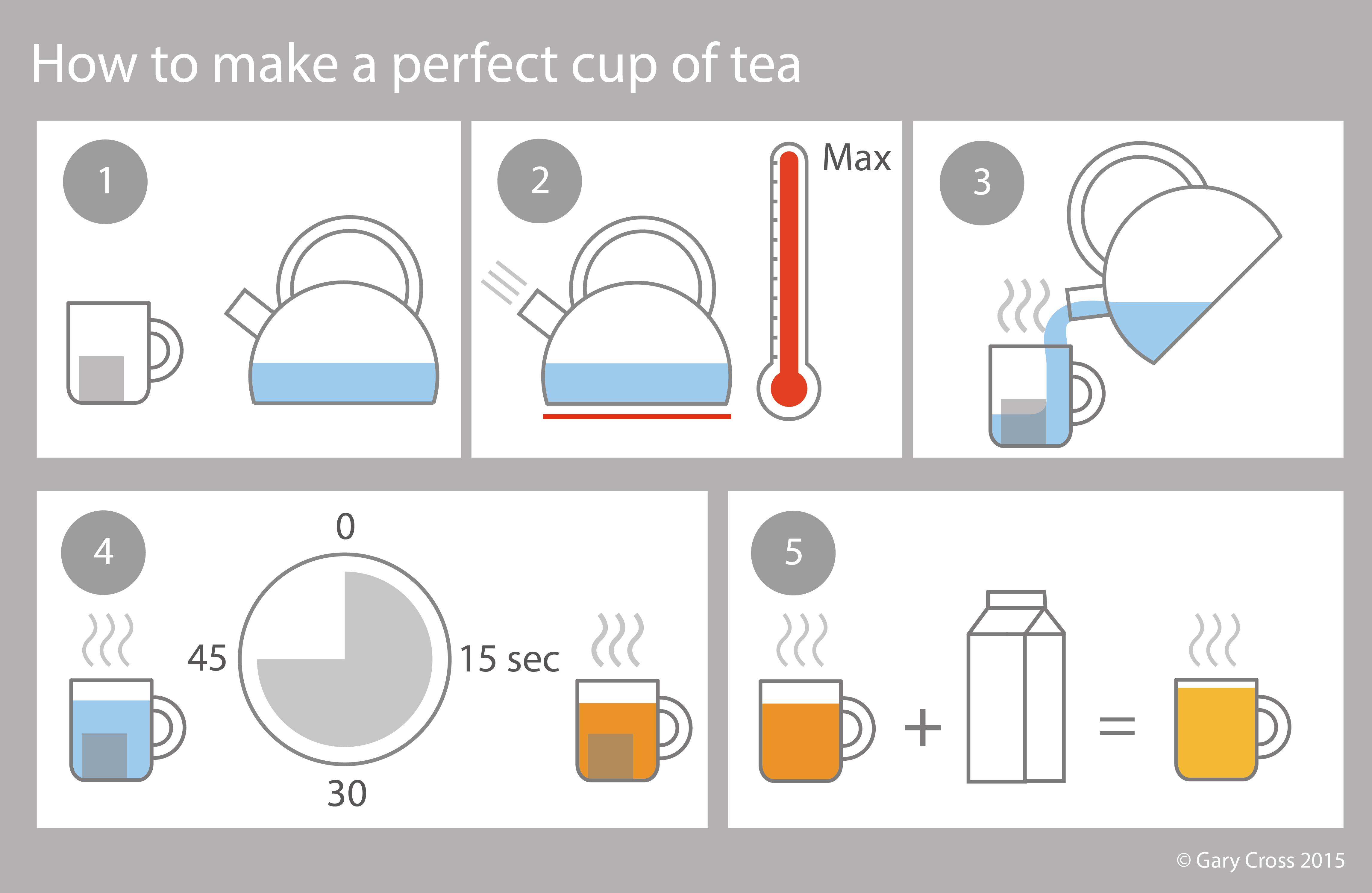
Below is part of a step-by-step tutorial for someone learning to use Adobe Illustrator. Three columns and two rows are vertically and horizontally aligned. The text box underneath the screen shots is unbroken, which helps guide the user from left to right rather than top to bottom. No numbers, labels or arrows are required.

© Gary Cross 2015
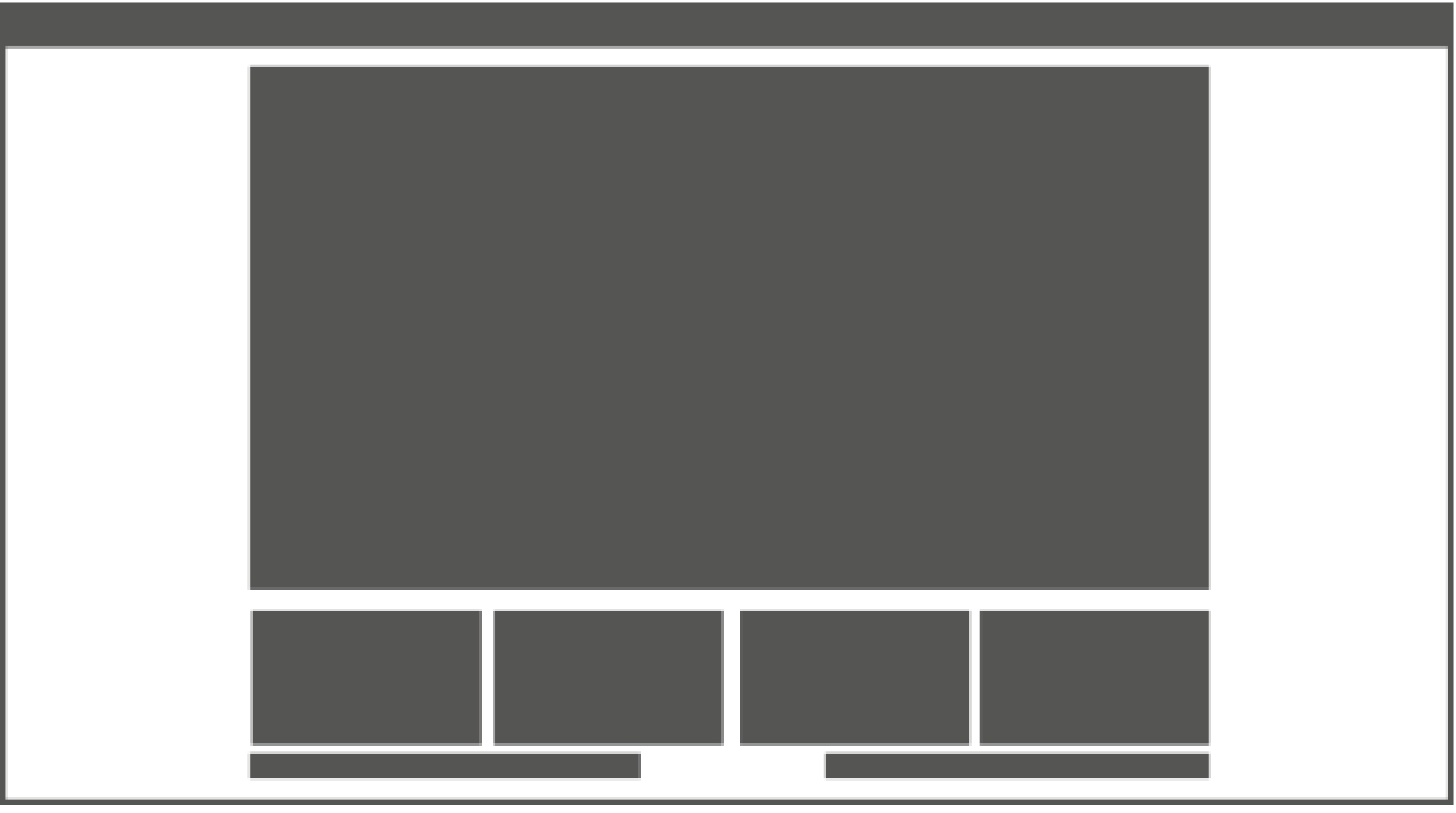 The principles of alignment and symmetry are often applied in the design of clear, cohesive webpages. The “three boxes” or “five boxes” grid layout includes a central focal point, often a large image. There is a mirror line or vertical symmetry down the centre of the web page and strong vertical and horizontal alignment. I also like the simplicity and the generous use of white space, which keeps the design clean and uncluttered.
Here are two web sites that use the three boxes or five boxes grid layout. http://www.apple.com http://www.paulsmith.co.uk


 visual design and instruction